OCC
Rebuilding a contractor sales platform so remodellers can measure, estimate and close in one seamless flow, and sell faster at scale.
One Click Contractor is a CRM and estimating platform for home-improvement contractors across North America, covering the sales journey from lead to signed estimate. The legacy product had grown by patchwork and was slowing the sales teams it existed to serve. As lead UX designer I owned user and market research, the redesign of every core flow, the new brand direction and the design system, working with a business analyst, a PM, engineers and a junior designer from discovery through delivery.
Role
Lead UX designer
Client
OCC (One Click Contractor)
Timeline
2022
Platform
Web app, design system, marketing website
Live
Visit site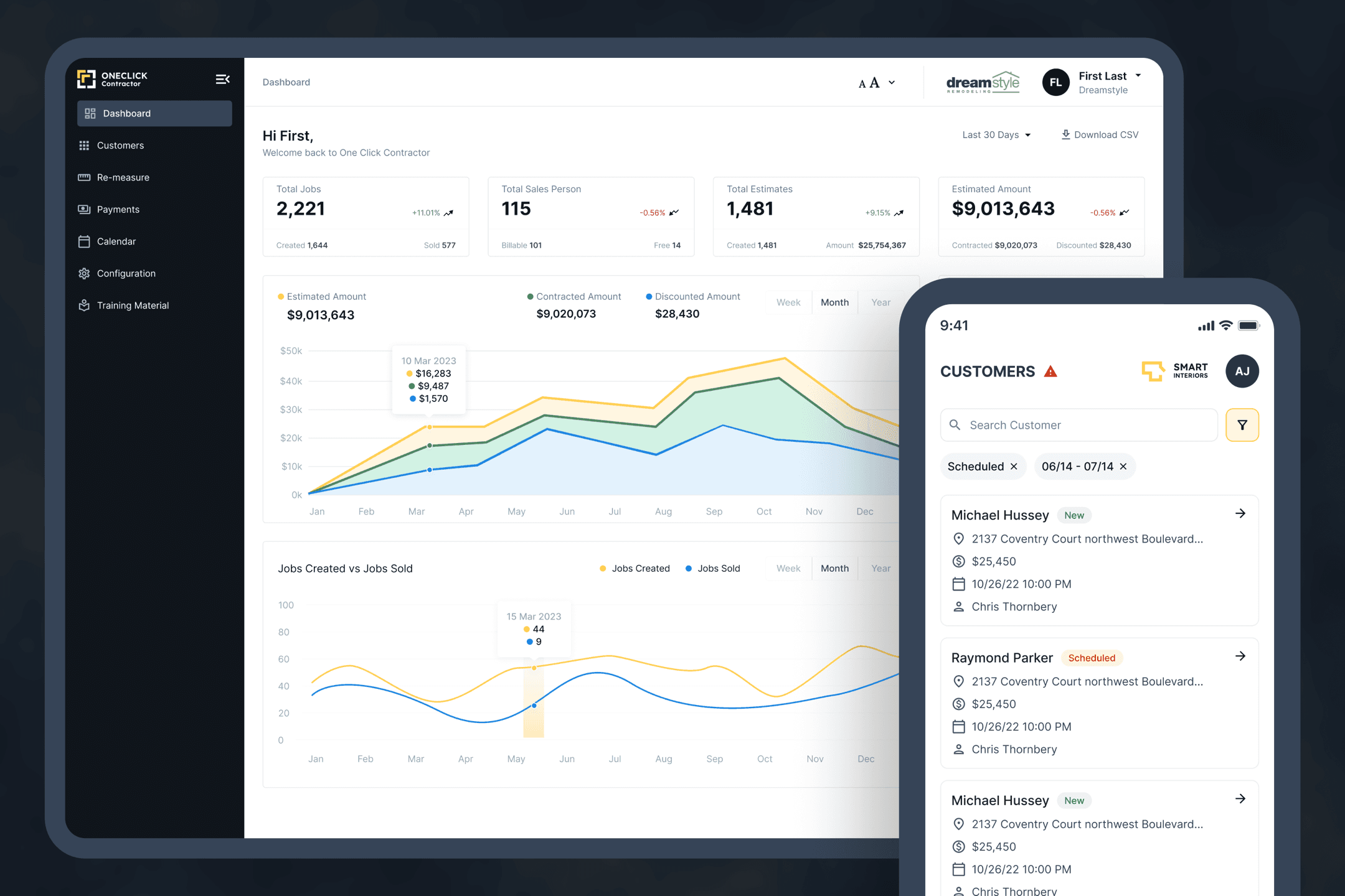
110 to 7
Settings consolidated into seven modules on one page
35%
Faster workflows after the redesign, client-reported
2.5x
Faster app responsiveness after the rebuild
Context
One Click Contractor sells to roofing, bath, window and remodelling companies whose reps quote in a homeowner's kitchen: measure, estimate, present, arrange financing, sign. The product had been extended for years without a shared structure, and it was struggling under rapid user growth and expanding field operations. Reps needed it to be faster, to survive patchy connectivity on site, and to be simple enough that a new hire could use it mid-season.
The brief was a rebuild without stopping the business: keep every workflow the sales teams depended on, make it faster and simpler, give it a brand, and leave behind a system the client's own team could extend. Partway through, the direction widened. OCC wanted to white-label the platform and sell it to other contracting businesses, which meant everything I designed had to work under a brand that was not OCC's.
Discover
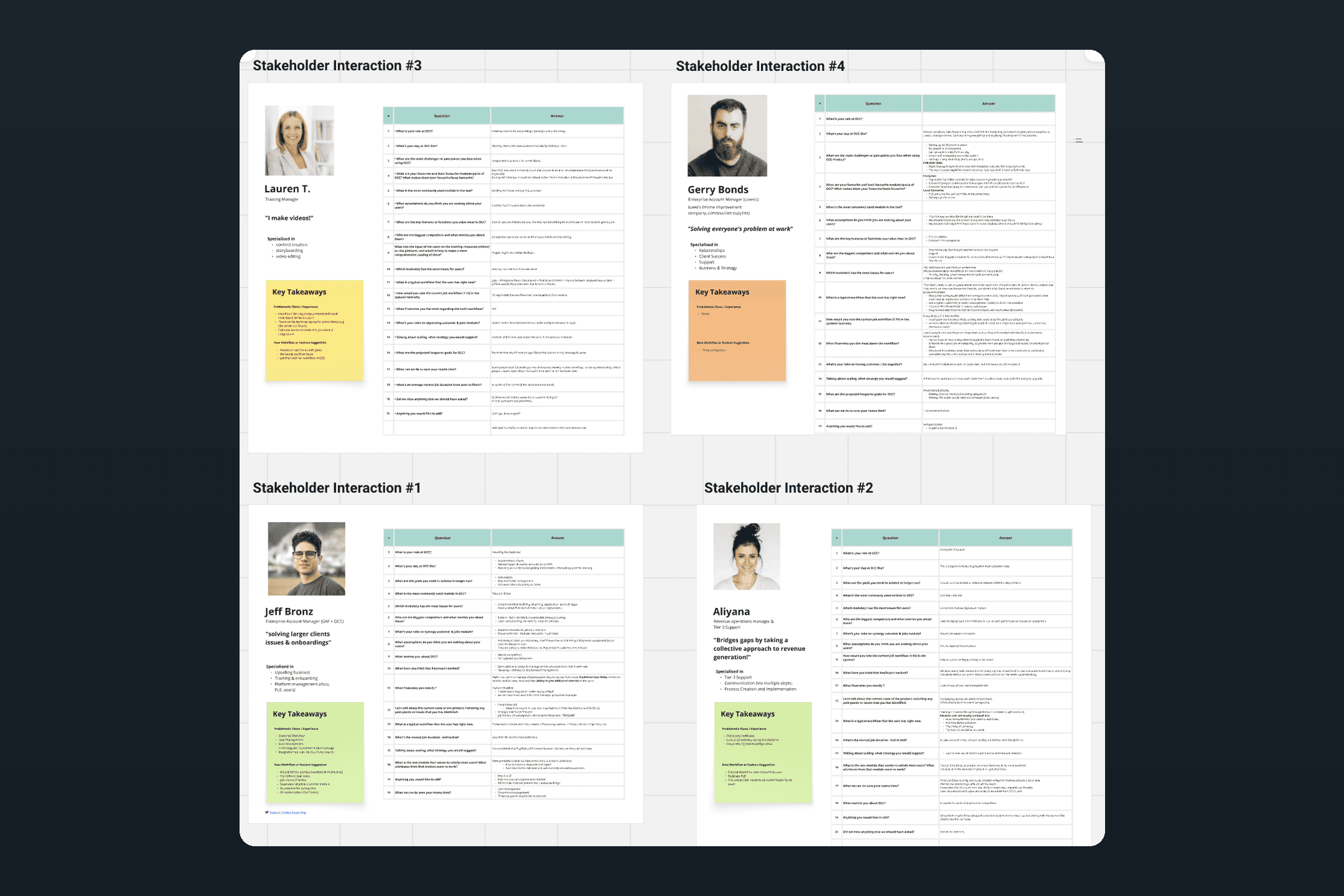
The work opened with stakeholder interviews, run on one script of twenty questions so the answers could be compared: role and a typical day, the modules used most and least, the flows that broke, how they rated the current job workflow out of ten, which competitors worried them, and what they would build first. The four sessions covered a training manager, two enterprise account managers, one on the Lowe's account and one on GAF and OCC, and the revenue operations manager who also ran tier-3 support.
Alongside the interviews I audited the product itself, page by page, and reviewed competing contractor sales tools. Two findings shaped everything after. The in-person estimate presentation was the slowest and most expensive step in the sale, a drive out to the customer to show a single quote. And most of the product's complexity was not in the daily flows at all; it lived in configuration, where 110 options had accumulated with no owner and no order.
Define
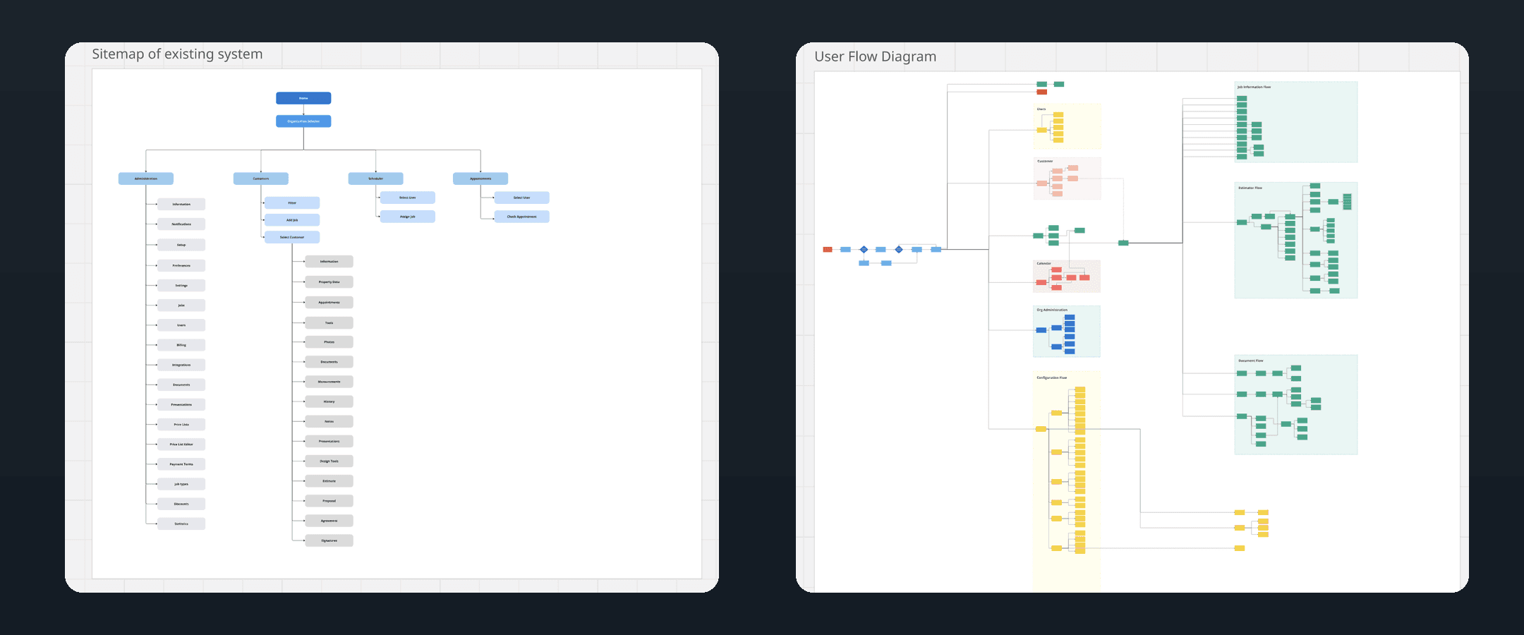
The audit became an as-is sitemap. Under a single organisation selector sat four branches: Administration with seventeen pages, Customers with fifteen sub-pages behind every customer record, and a Scheduler and Appointments area that overlapped each other. From there I mapped the user flows for users, customers, calendar, organisation administration, configuration, job information, estimating and documents. Configuration was the largest branch on the board, which confirmed the interview findings.
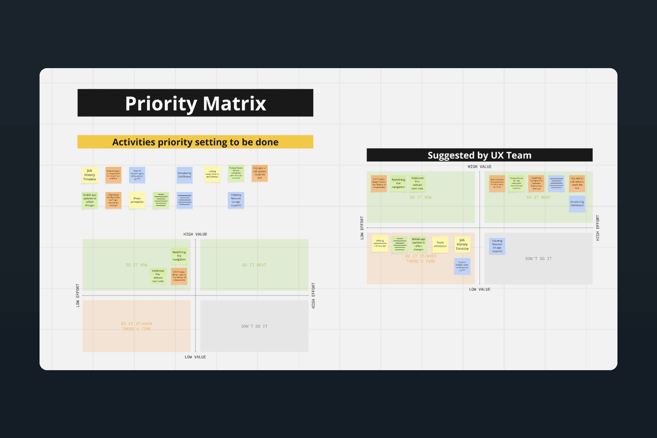
Everything the interviews and the audit had surfaced went onto a value-against-effort matrix, first as a raw list and then as the UX team's recommendation. Do now: the design system foundations and components, a redefined navigation, and additional predefined user roles. Do next: organising the configuration settings, letting the client's own team edit options inside the tool, and a dashboard. If there was time: unifying appointments with the calendar, photo annotation, a job history timeline, and more document types. In-app ticketing was cut.
That matrix was the definition of scope. Every screen that followed traces back to a card on it.
Design decisions
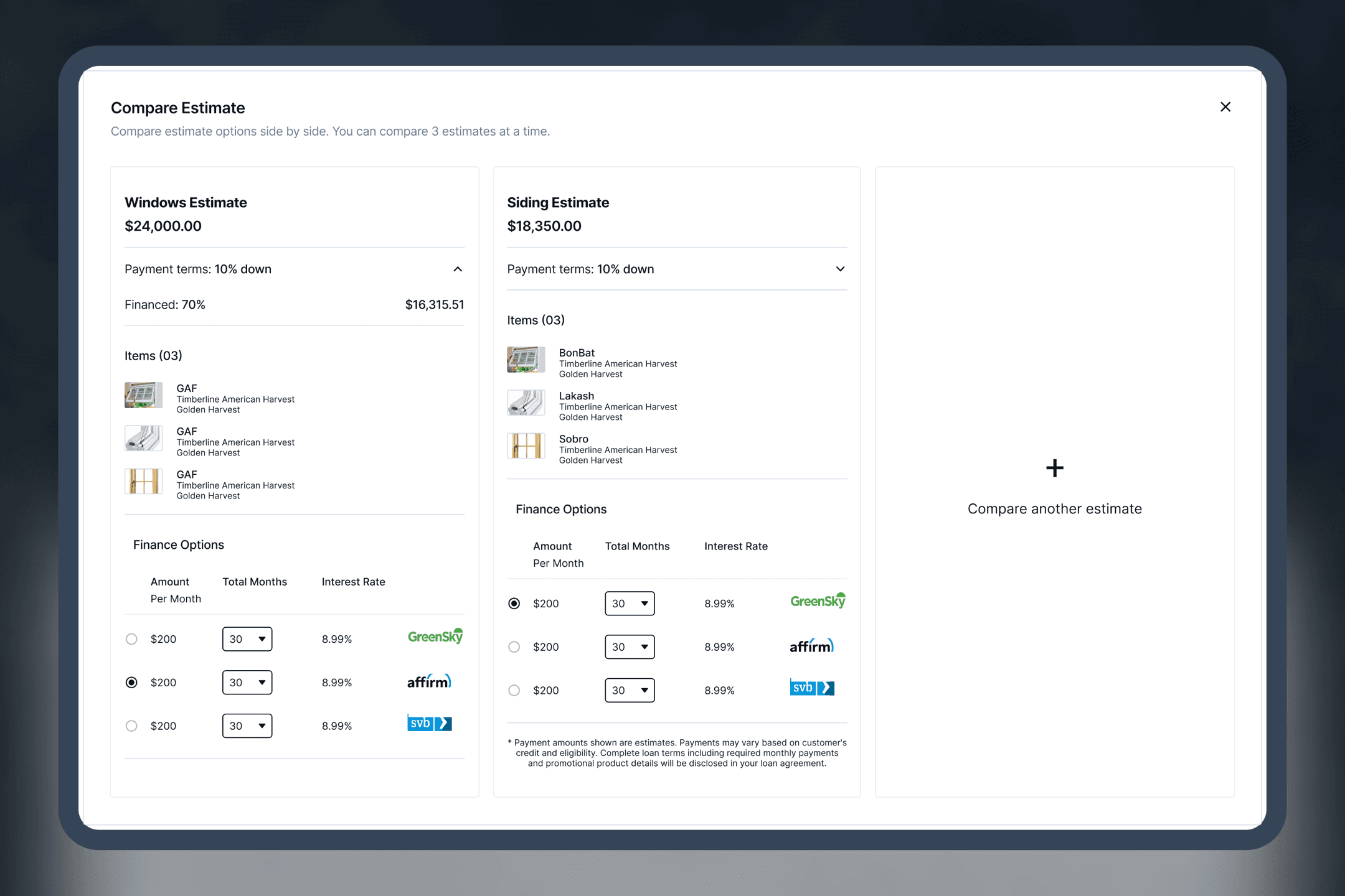
- Estimate presentation as a module. A contractor can build several estimates for one job and present them to the homeowner side by side, remotely. It removes a trip from every sale and turns a single take-it-or-leave-it quote into a comparison the customer can choose from.
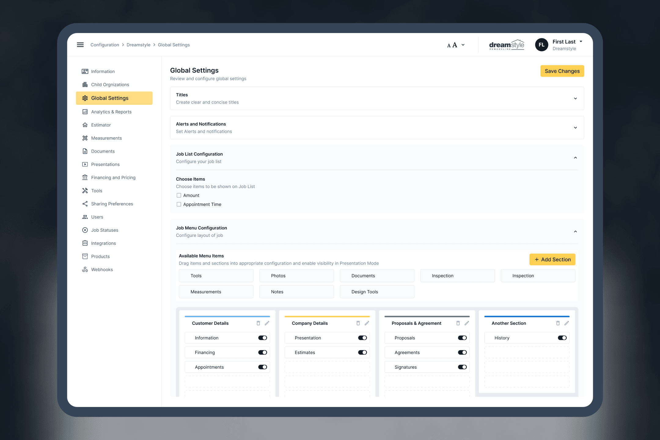
- Settings consolidated. I mapped all 110 configurations, grouped them by the job they do, and rebuilt them as seven modules on a single settings page. An admin can find any setting without a support ticket.
- Field-first flows. The core journeys were redesigned around how field workers actually log and input information, with offline treated as a normal state rather than an error. Reps manage leads and projects without cellular data and the app catches up when the signal returns.
- One sales journey, not five features. Capture and measure, build the estimate, present, offer financing, sign and collect. Each step was redesigned to hand off cleanly to the next, which is where the reported workflow gains came from.
- A brand-neutral design system. Tokens and components were built so the whole product can be re-themed for a white-label customer without touching the screens.
Design system and delivery
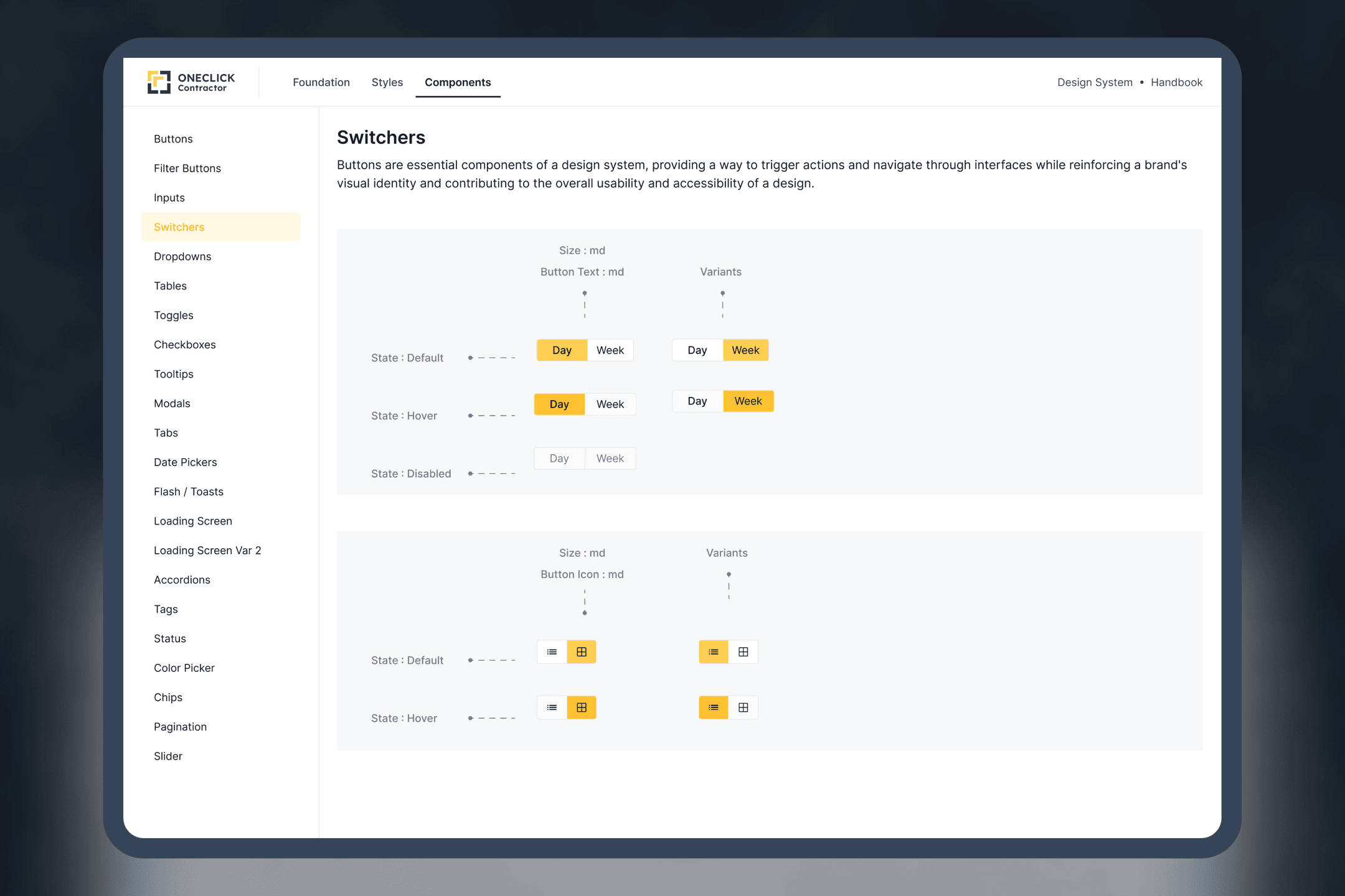
The design system covers the web app and the new marketing website: tokens, a component library and documentation, applied consistently by the junior designer producing screen variants under it. Engineering received components and rules rather than a pile of screens, which is what made the white-label direction realistic. A new brand is a token change, not a redesign.
The rebuild on the engineering side moved the platform from patchwork fixes to a stable, unified architecture. The two efforts were designed together so the new front end had a system to be built against.
Outcome
The rebuilt web app, the design system and the new marketing website shipped in 2022. Contractors no longer travel to present estimates. The client reports workflows around 35% faster after the redesign, and the platform rebuild delivered 2.5x faster app responsiveness and 70% faster load times. Field teams work offline, and the product is positioned to be sold to other contractors under their own brand.
What I took from it
The biggest wins in a revamp are rarely on the screens people use most. They are in the step everyone had accepted as unavoidable, like the drive to present an estimate, and in the settings nobody wanted to own.