In progress
Lumily
Designing a pediatric health wearable app where one trustworthy 3am alert matters more than a hundred features.
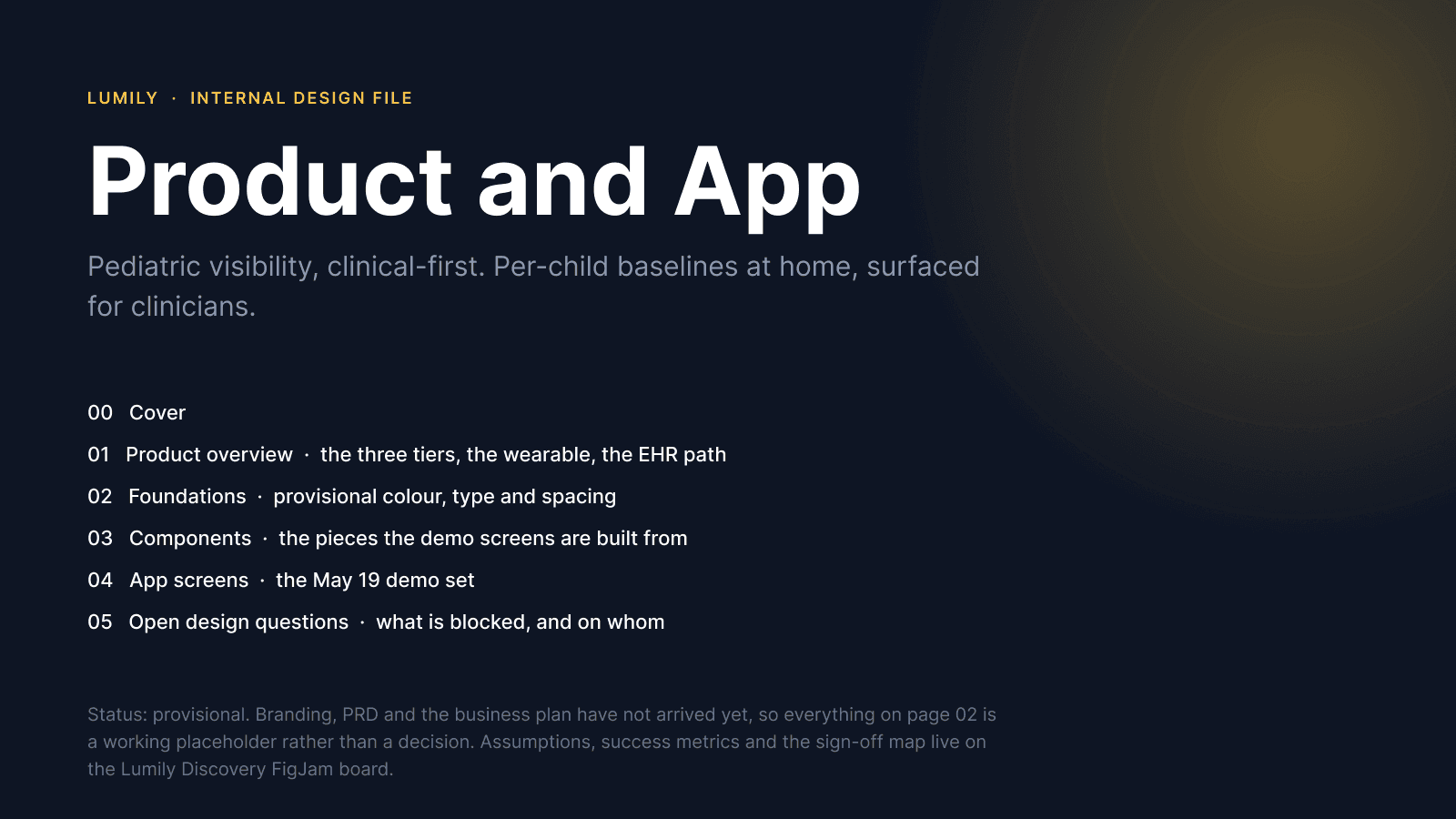
Lumily is a wearable and companion app for children aged two to ten, built on each child's own baseline instead of a population average. As the only designer and design engineer on the team, I took it from the founder kickoff through research, information architecture, design tokens, a component library, hi-fi screens, microcopy, the usability test plan and the React Native technical spikes.
Role
Lead product designer and design engineer
Client
Lumily, early-stage HealthTech startup (US)
Timeline
April 2026 to present
Platform
iOS and Android app (React Native)
1
Metric that decides whether the product works: alert precision. Capturing it had to be designed into the alert itself
16
Screens in the v1 information architecture. Eleven of them exist to make one interruption trustworthy
35
Assumptions risk-rated in a tracker before anything was designed or tested
11/20
Colour pairings that failed WCAG AA at token level. Fixed with eight new tokens before a single screen existed
26
Variables retuned when the brand direction changed. Zero components rebuilt, zero screens redrawn
0
Numbers a parent has to interpret inside an alert. A number at 3am is a task, not an answer
The brief
The founder came to me with a wearable concept, a pitch date and no app. Children aged two to ten sit in a gap: infant monitors stop at 18 months, clinical wearables start at 12 or 18 years, and nobody holds an indication for the ages in between. Lumily's idea is a sensor that learns each child's own normal and tells the parent when something has changed from it.
The near-term goal was concrete. Two or three on-brand, clickable screens for a pitch on 19 May, backed by a design system, doctor-reviewed metrics and real parent feedback. The long-term goal is hospital-grade post-discharge monitoring inside Epic.
What I owned
- The app prototype, the design system and the alert experience, end to end.
- The tech stack recommendation and the technical spikes that de-risked it.
- Research operations: discussion guides, screeners, synthesis and the usability test plan.
- An advisory seat on the hardware programme run with a university engineering team.
The constraints that shaped everything
- No in-room hardware. Every competitor that reliably wakes a parent does it with a base station or a camera. Lumily has only the phone.
- No diagnosis, no emergency instruction. The founder ruled out any 911 instruction as a liability risk, and the FDA's warning letter to Owlet shows that the claim, not the sensor, is what makes a product a regulated device.
- Every clinical word belongs to the doctor advisors, not to design. I wrote first drafts so they had something specific to correct.
Research
Kickoff, recorded as measurable metrics
A 34-minute founder session produced her success criteria in her own words. I rewrote each one as something that could actually be measured, and built a sign-off map of who can approve what. That map surfaced the biggest structural gap on day one: nobody owned HIPAA, security or FDA regulatory, and that blocks two of the three product tiers.
We're only sending that push notification if it needs to be seen right then, so we're not constantly pushing out things to parents to freak them out.
That one line became the alerting standard for the whole product: near zero non-actionable alerts, and precision over recall.
Competitive teardown, verified against primary sources
Five products compared on identical criteria, with every regulatory claim taken from the FDA 510(k) or De Novo record and every price from the company's own store. Anything I could not confirm is marked unverified in the document rather than smoothed over, because getting a competitor's FDA status wrong in a pitch room costs more than not mentioning them.
The most valuable finding was not regulatory. In an adverse event report a parent described receiving a yellow alert when she expected a red one. The manufacturer found no malfunction. The device worked and the communication did not. Yellow meant "I cannot see your child" and red meant "your child needs you", and a parent at 3am does not reliably hold that distinction.
The evidence that decides the alert design
Three published papers mattered more than the rest. The one that shaped the product most showed that the smoothing which keeps false alarms away is the same smoothing that hides real events. That tension lands directly on a per-child baseline claim, so it was written into the assumption tracker before the interviews rather than discovered after them.
Current-state journey
I mapped how two very different parents get from "something seems off" to a clinical decision today, including their workarounds, because the workarounds are where the product opportunity is. Photographs of thermometer readings lost in a camera roll. A written log that stops exactly when things get bad enough to matter. Phone video recorded to show a clinician something that will not repeat on demand.
Three findings came out of it. The pain is the decision, not the measurement. Both parents already run a workaround the product should absorb rather than replace. And the episodes that resolve are the ones that vanish, so a product that quietly keeps the record of nothing happening is doing its most valuable work on the nights it says nothing at all.
Define
Three users, three problem statements
A parent of a typically developing child, a parent of a nonverbal or medically complex child, and a clinician share one product and have almost nothing in common. Collapsing them into one problem statement is how a product ends up serving none of them, so I wrote three, plus a set of anti-personas describing who the product is explicitly not for.
A real conflict, resolved on purpose
One parent needs the product to stay quiet. Another needs it to never miss. Precision and recall pull in opposite directions and v1 resolves it in favour of precision, because a product that cries wolf in a category already carrying documented alarm fatigue does not get a second chance. The cost of that decision is written down next to it.
Cutting 48 candidate metrics
The founder's concept carried 48 displayed metrics, three tiers, a caregiver network and an upgrade path. I scored every feature against the problem statements and produced a must, should and later list. The must column became two loops: the night loop, which is the alert, the guidance screen and the outcome capture, and the morning loop, which is a widget, a one-line Today screen and a night detail view. Everything else waits.
Assumptions before opinions
Thirty-five assumptions across product, clinical, brand, tech, business and ways of working, each rated by risk and by how cheaply it could be tested. The tracker is the document the founder and I go back to whenever a new instruction conflicts with an old one, and the question is always which one moved.
Success metrics
- Alert precision: the share of alerts a parent confirms were worth being woken for. This is the number that decides whether the product works, and it cannot be computed unless the app asks what the parent found.
- Trusted silence: nights with no alert where the parent did not open the app to check anyway.
- Escalation chain integrity: the share of households where the alert path works end to end, with permissions granted on every caregiver's phone.
- Time in app is treated as an anti-metric. The healthiest user opens it once a morning for a few seconds and never at night.
The 3am alert flow
The flow the whole product rests on. An alert fires, and the questions are who is woken, what they see, what they do, and what happens if nobody answers.
Trustworthy comes before serious
The most important ordering decision in the flow. The first branch asks whether the reading is trustworthy, and only then whether it needs to be seen right now. A sensor that cannot see the child exits quietly, before any alarm is considered. Sensor confidence and clinical concern never share a channel, a colour or a screen.
The held path is the everyday product
Anything that fails the needs-to-be-seen-now test is not discarded. It is held for the morning summary, where the pattern across six mild nights becomes visible. That is the product on 364 nights of the year.
The escalation chain replaces the base station
If the primary caregiver does not acknowledge within thirty seconds, the alert escalates to a secondary caregiver, and keeps both phones ringing if nobody answers. A base station shouts into one room. A chain reaches a parent who is out, a phone that is dead, or a household with one adult. It is the strongest argument that a mobile-only product is a deliberate design rather than a compromise. Thirty seconds is a starting number and it is one of the first things the usability study measures.
The two taps everyone would cut
After checking on the child, the parent reports what they found in two taps. Alert precision cannot be calculated without it. Not one of the five competitors captures this. It costs two taps at the worst possible moment, which is exactly why it had to be designed rather than bolted on, and why the product never nags at 3am: if the parent dismisses and sleeps, it asks in the morning.
Twelve edge cases, each with a home
Not worn, offline, calibrating, permission not granted, no secondary caregiver, a grandparent in another timezone, two children on one phone, repeated alerts in one night, a battery dying mid-night, and more. Most of them are more common than the happy path. The one I treat as the critical failure is a phone whose full-screen alert permission was stripped at install: the app looks completely normal and will not wake anyone. That state gets a banner that never dismisses.
Information architecture
Three tabs, and that is the ceiling
Today, History, Settings. The forty-second morning check has to land on the answer without a decision, and every additional tab is a decision. A fourth tab would come from the temptation to give metrics their own home, which is exactly the drift the cut list removed.
The alert is not in the navigation
The alert is an interrupt layer that sits above the whole app, not a destination inside it. It arrives over the lock screen, it has no tab bar and no back button, and it has one way out, which is answering what you found. At 3am the product has exactly one job and the interface has exactly one affordance.
Depth limit
Nothing in v1 is more than two levels below a tab. Sixteen screens in total, and eleven of them exist to make one interruption trustworthy. A monitoring product looks like it should be organised around data. This one is organised around a single moment and the credibility of the silence around it.
Wireframes
Sixteen greyscale frames drawn at 390 wide, each traceable to a must-have and a flow. Greyscale was the point, not a shortcut: branding had not landed, so drawing in colour would have meant inventing a look and then defending it. In greyscale the only thing left to argue about is what earns space and what comes first.
Three alert layouts, one winner
Sentence first, reading first, and action first. Sentence first won. Reading first hands a frightened parent a number to interpret. Action first is the fastest, and that is exactly why it is dangerous: it makes dismissing easier than reading, which destroys the outcome capture the whole metric depends on.
One layout rule flagged as a safety rule
Text scaling to 200 percent must never push either alert action off screen. Mobile only, 320 to 430 wide, with five questions written for the founder walkthrough before it happened rather than after.
Design tokens and accessibility
Tokens before components, components before screens
Every fill, stroke, radius and spacing value in the file is bound to a variable. Type is applied as text styles. The reason is not tidiness. The founder had said the brand was temporary, so the palette was built to be reacted to, and the day the real direction arrived it had to be a values change rather than a rebuild.
A contrast matrix run at token level
Every foreground and background pairing was checked against WCAG AA before a screen existed. Eleven of the twenty pairings failed. That is a normal palette, not a bad one: the colours had been chosen as fills and nobody had yet asked them to carry words.
The fix was architectural. Every status colour now exists twice, once as a fill and once as an ink, where the ink variant is darkened until it clears 4.5:1. Eight new tokens, including a focus ring that had not existed at all. Nothing on screen looks different at a glance and every word in the product now passes.
The finding that mattered most
A white label on a red button fails AA at 3.62:1. The most conventional way to draw a critical action in this entire category does not pass, and it is the exact control a frightened parent has to find without their glasses. Near-black on the red clears it at 4.90:1, so the alert screen uses that instead. It reads as unusual for about two seconds and then reads as more urgent, because it is heavier on the page. Finding this in an audit would have meant redrawing the one screen the product rests on.
Rules that fell out of it
- Text colours and fill colours are different tokens and are never interchangeable. The ink suffix means it may carry words.
- Nothing in the alert path uses a status colour as text.
- A hairline border may never be the only separator between two interactive regions.
- There is no dark mode, and that is a product decision rather than a scope cut. The one critical screen must be light, and a monitoring app does not benefit from a theme that inverts everything around it.
Component library
Ten components and twenty variants in Figma, with usage guidance written into each component's description so it travels with the component. Button, status banner, info row, choice row, caregiver row, check item, tab item, chip, progress bar and alert header.
The state list is the real output
The variant grid is the cheap part. The decision per component about which states exist at all is the work, and in this product the states that matter are not hover and press. They are calibrating, not worn, offline and cannot-be-woken, every one of them a state where the app can look like it is watching when it is not.
Rules baked into components
- Never two primary buttons on one screen. Minimum 60 high so the alert actions stay reachable one-handed.
- Selection on a choice row is a border weight change, not a colour flood, because a colour flood at 3am reads as a verdict.
- A calibration progress bar requires its caption, because a bar without a number is a mood rather than information.
- The alert header puts the child's name first, always. One clause, no number.
Gaps, listed rather than glossed
No pressed states yet, no icon set, not yet published as a library, and four new colour pairings that still need adding to the contrast matrix. They are written into the file so the next person, including me, cannot mistake a draft for a finished system.
Brand retune
Partway through, the founder shared a moodboard: a warm blush ground, large calm colour fields, soft radii, no borders, and headlines that mix regular and bold weight inside one sentence. I read the direction off the reference, documented what I had inferred so she could correct me, and retuned the system.
Twenty-six existing variables took new values and six were added. No component was rebuilt and no screen was redrawn. That is the payoff for spending the tokens phase before the components phase, and it is the evidence I showed her that changing her mind about the look is cheap from here.
The one rule the palette needs
A field colour never carries meaning, and a status colour is never used decoratively. In a health product, a colour that means nothing sitting next to a colour that means something is dangerous, because a parent learns to read colour as signal and then meets a sage card that is just a sage card.
The desaturation trade
Every status colour is softer than the set it replaced, which suits a founder who wants to control fear-mongering. It also means none of them can carry a signal alone, so severity always has a word next to it. That was already a copy rule. The palette made it structural.
The open question I kept open
The reference is a mental wellness app, warm and encouraging. Lumily is clinical-first and its worst moment is a 3am interruption about a child. The warmth is right for the 364 ordinary mornings. Whether it is right for the two nights a year the product exists for is a question I answered with two alert registers built side by side for the usability study, rather than with an opinion.
Content design
In most products microcopy is polish. Here it is the surface where the product can mislead a frightened parent, so it was written before the components rather than after them, and every string is a draft for the doctor advisors to correct.
The rules
- Observation plus next step. Never a diagnosis, never a command. "Breathing has changed from Rowan's normal", not "Rowan may have a respiratory infection".
- Name the child first in anything urgent. Siblings on one account is not an edge case.
- Say what the product cannot do in the same breath as what it can. "Lumily cannot tell you what is different until it knows what is usual."
- No number a parent has to interpret. Numbers live in History, where there is time and daylight.
- Absence of information is never reassurance. Not worn, offline and calibrating all mean Lumily does not know, and none of them may borrow the language of a normal night.
- Never imply anyone is watching. There is no monitoring centre and no nurse line, so the word monitor is banned in parent-facing copy.
- Neutral, not alarmed and not soothing. The register is a calm colleague stating a fact.
Vocabulary as a design decision
"Rowan's normal", always possessive, never baseline or healthy range, because the whole differentiator is that normal belongs to this child. Worn and not worn instead of connected, because connected is about the device and worn is about the child. Target reading level is grade 6 for anything read at night, because stress narrows comprehension and the alert is read under exactly that condition.
Engineering spikes
This is the phase most designers hand off at. I do not, and it is the reason the process holds together. Two spikes ran before anything downstream committed to a behaviour.
Can a phone alert actually wake a parent?
Whether a full-screen alert that breaks silent mode is permitted at all on iOS and Android 14, which strips the full-screen intent permission at install. The phone is the only channel that can wake a sleeping parent, and one competitor documents plainly that its alerts cannot override the phone's settings. Cheap to answer, and the whole product depends on it.
Does React Native cover that path?
Whether the alert path is reachable in React Native without native modules, so the stack recommendation was based on evidence rather than preference.
The device contract
I wrote the contract between the wearable and the app in plain terms: the device reports a reading and a confidence, and it never sends a severity. Severity is a product judgement made against the child's baseline, in the app, where it can be tested, tuned and explained. That single rule keeps the yellow-versus-red failure from ever being possible.
Usability testing
The study is designed around the moment that matters rather than the whole app. Five participants recruited through a screener, tasks phrased as goals rather than instructions, and six fatal-failure criteria defined in advance so a session cannot be argued into a pass afterwards.
What the study is built to answer
- Whether one sentence with no number is enough at 3am, or reads as the app hiding something.
- Whether thirty seconds is the right acknowledgement window before escalation.
- Whether the warm alert register or the severe one earns more trust under stress.
- Whether "What did you find?" reads as a question or as the app asking the parent to make a judgement.
I run the sessions myself. It is one of the things I keep out of AI's hands on purpose.
Where AI fit, and where it did not
AI removed about a third of my calendar time on this project and none of my decisions. It clustered interview quotes into candidate themes, generated the full variant matrix per component so no state was forgotten, ran an adversarial pass on my synthesis to catch the interesting finding crowding out the common one, and scanned the build for mechanical accessibility failures.
Every generated fix was verified by hand, because generated accessibility fixes look correct far more often than they are correct. I kept final scope decisions, accessibility sign-off, and running interviews and test sessions for myself. What I did with the time it gave back was a second round of research, which is the thing that used to always get cut.
What is still open
- Doctor advisors have not yet reviewed the alert and guidance wording, and nothing clinical goes on stage until they have.
- The alert register, warm or severe, is decided by the usability study rather than by me.
- HIPAA, security and regulatory ownership is unassigned inside the company. I flagged it on day one and it remains the gap that blocks the clinical tiers.
- The hardware is on a university programme timeline, so the app is being built against a device contract rather than a device.
In progress. Shared with the founder's permission. Clinical wording shown here is a draft pending sign-off from the doctor advisors, and some artefacts are withheld until launch.